Thursday, March 28, 2013
Marble bust_edit
I redesigned the marble bust project.
I used same effect to the statue and the pillar.
I made blood more carefully and added cracks and web brush.
Tuesday, March 26, 2013
Ad campaign_edit
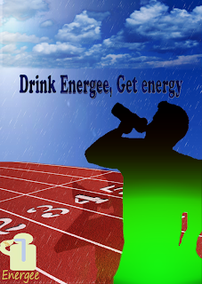
This is the edit version.
I added silhoutte to the person and made more gradient effect to the person.
I changed the blend mode of the clouds and track.
I changed the typography so that it looked more clear.
Thursday, March 21, 2013
Advertisement Campaign


tutorial links:
1. http://www.photoshoplab.com/make-your-own-ipod-style-photo.html
2. http://designinstruct.com/digital-art/make-a-vintage-planetary-landscape-poster-in-photoshop/
3. http://www.tutzor.com/tutorials/designing-war-movie-poster
The top one is my final copy.
First, I made the football player sillihoutte using number1 ipod tutorial.
Because the target audience is all ages, especially, athletics.
I used gradient tool to the body to show the effect of the energy drink.
The green gradient means energy. I chose green color because green color appeals the feeling of
energetic and water.
I chose the sky the background. Then I made the clouds using a number2 tutorial.
I used color range and eyedropper tool. I added clouds to the sky and used eraser tool to fit to the sky.
Then, I added the track. I chose the track image because i thought that the track image is going
to appeal to the athletics. I wanted to show that this energy drink is necessary for the athletics.
I added my typography. The slogan is used my packaging design at last fall.
I thought the slogan also is going to appeal to the athletics. Athletics need energy drink while they are playing
the sports. I highlighted Energee because this is the product name.
I chose blue color because it goes well with the sky.
I chose this font because this is straight. I made the text layer to the middle of the layer.
I changed the blend mode of the text layer.(satin,inner glow..)
Then, I added the rain. I used number 3 tutorial. I used Blur,Noise,Level effect.
I added the rain because I wanted to show that this energy drink will give you energy right now as if
you will be wet as it rains.
Finally, I wanted the ad is clear appeal, so I merged all layers.
I made a stamp copy of the layer, then I changed the blend mode to soft light and changed the opacity
to 60%.
-Probably, I am gonna be absent on Friday, so I posted it now.
Thursday, March 7, 2013
Marble Bust
This is my final copy.
First, I isolated the statue and my face, then sized appropriately.
Then, I desaturated my face, and made purple color face.
I learned new tool, Photo Filter tool. I clicked this effect, but I didn't see the effect clearly.
Then I added Rocky Texture and highlighted the statue with brush tool.
Isolation part was easy. Only I had to do is making a selection, selecting inverse, then deleting it.
The hardest part was making blood all over the statue.
I changed the opacity of brush tool, and brushed with white,red,black color.
It didn't look like real blood. It was hard to brush the blood and drips.
Finally, I added more textures. I added cracks texture, and web texture.
I used desaturate effect and Levels effect.
I could add cracks texture, but web texture didn't work.
When I use Levels effect, it didn't turn out like the tutorial.
So I couldn't add web texture.
Friday, March 1, 2013
Movie Poster_2
URL link: http://www.tutzor.com/tutorials/designing-war-movie-poster
The top one is my final image.
First, I should cut the soldier out of the background using the Pen tool and delete the background.
However, I could not make the selection using the Pen tool, so I just cut the soldier
using the Quick selection tool, then I copied into the new layer.
I have to learn more about Pen tool.
Then, I duplicated the sky image and set Adjustments-Black&White.
I copied the layer so that I could set the sky darker, and also made the soldier darker.
It was easy to change the adjustments but the final copy does not look like very dark sky.
I need to make sky darker...
I used new effect, Filter-Chrome to make the soldier look like he is wet.
It was easy to make effect, but I did not understand how I make the layer exactly fit in to soldier.
Then, I made rain using Noise, Blur effect, and new adjustments, Levels.
It did not look like real rain, although I changed the detail as the same as the tutorial.
So I changed the opacity of the layer lower and lower.
I made "war" texts.
I changed the layer style, but it did not turn out the same as the tutorial.
Finally, I made more texts above the soldier.
I did not add the texts under the soldier because I could not see the letter.
Subscribe to:
Comments (Atom)


